Redesigning Here East's digital presence for a change of audience
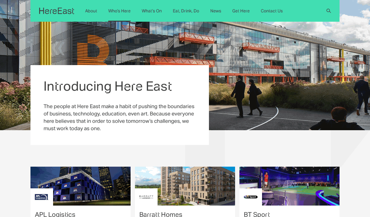
Here East is a campus of makers, students and different innovative businesses, located in the Queen Elizabeth Olympic Park.
The old website was focused on lettings, but as the site filled up to around 80% let, the website audience had shifted from potential tenants to current tenants and visitors. The campus needed an updated website to better meet the needs of this new audience
We designed a new refreshed website, focused on bringing the campus to life digitally; showcasing the tenants & retailer businesses and improving the wayfinding content for visitors. We also built a component-based design system driven by a flexible CMS, and refined the innovative & disruptive digital brand language to be more “grown up” and usability-focused.
⭐ key contributions
UI Design, UX Design, Prototyping, Design System
🙋♀️ TEAM
3x Experience Designers (including me!)
1x Head of Brand Experience
2x Head of Departments
1x Creative Director
1x Copywriter
1x Technical Lead
2x Developers
1x Senior Account Manager
1x Project Manager
Collaborating with client-side Marketing team.
Outcome
🚀
Successful launch
Successful launch of new site, which is still live today (albeit with a few tweaks – HereEast.com)
🧑💼
Increased visibility for businesses
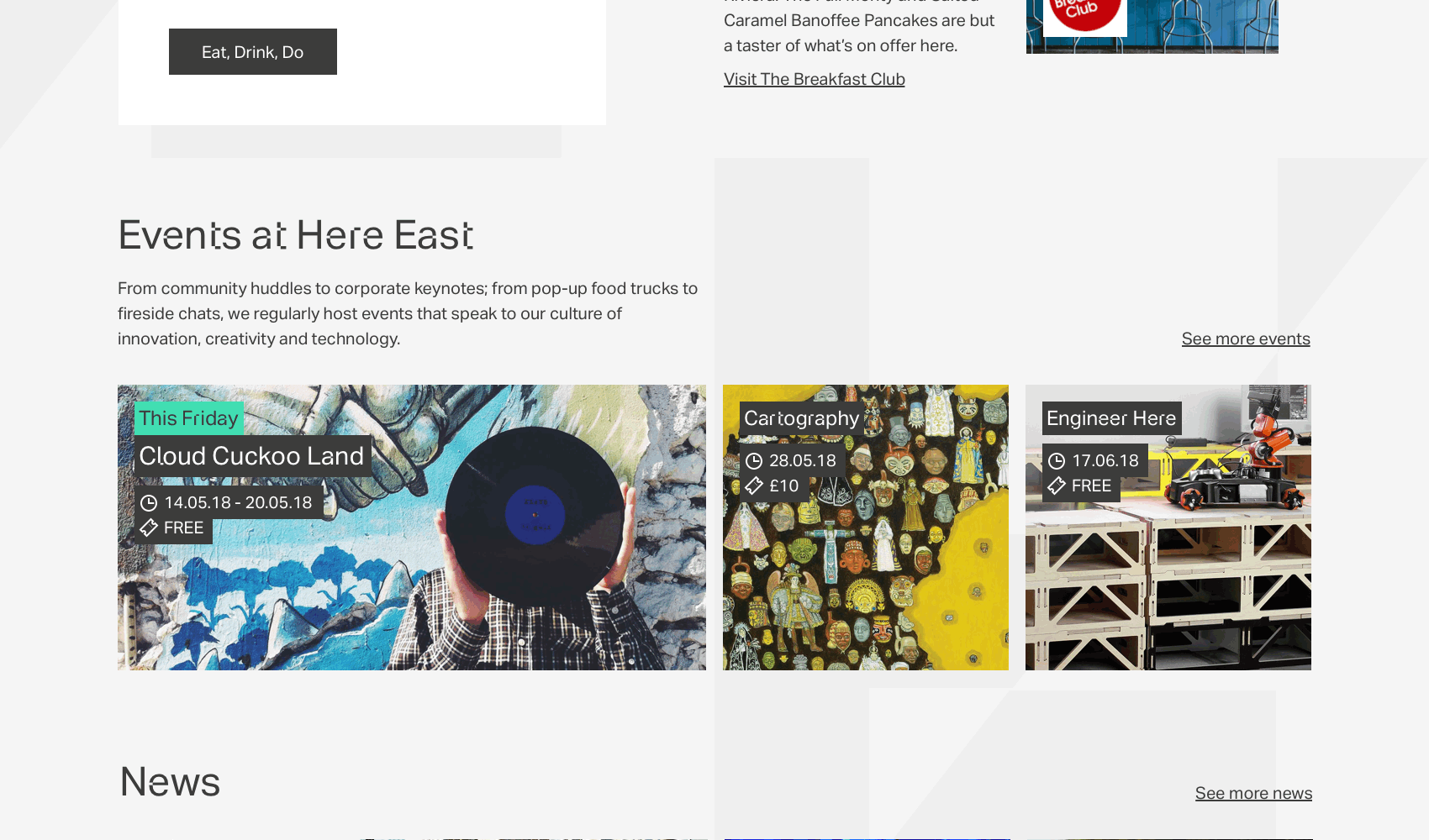
Increased visibility for tenants, showcasing their culture to visitors and prospective employees, and also for food, drink & leisure retailers, giving them a presence to promote their offerings (and menus!), whilst also giving visitors an easy way to browse all food, drink & leisure options available at Here East
🧭
Improved wayfinding
Improved campus wayfinding for visitors – plus an online resource for tenants to send to their visitors for accurate tenant-specific directions (the entrances are sometimes hard to find otherwise!)
⏱️
Reduced time-on-task
Easier management of website for Marketing team, leading to less time on task needed to upload & edit content
🍩
Happy client!
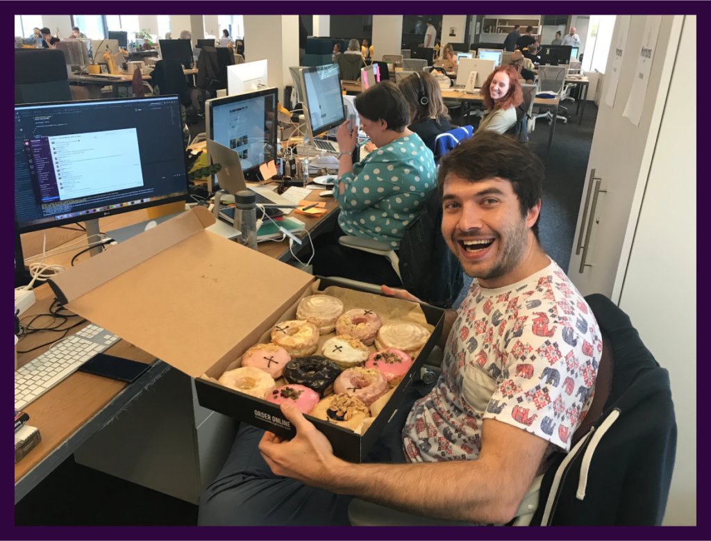
A very happy client – who even sent us the biggest box of doughnuts to show their appreciation!
How did I have an impact?
Refined brand language for digital use (and accessibility fixes!)
New Design System, including component designs that flex for CMS use
Aligning on features, functionality, page hierarchy and content
Usability testing of designs with Here East tenants and members of the public
Full page designs (responsive; desktop & mobile) for each unique CMS template
Collaboration with copywriters on final page content
Collaboration with development team during design sprints, then QA of development work against page designs & components, with deployment-ready QA code fixes
Guidance for client (content authors) on components and how to use them in the CMS
Explorations of features, content and refreshed UI design
Defining new content & functionality needed, and exploring how the design language could be refined for the new site.
We looked at the current site for well-performing content, visuals and digital design elements – to firstly ensure the new design still felt familiar, but also to carry over things that were working well! We realised that the disruptive, off-grid, off-set design elements worked well as a nod back to the branding (building that all important brand equity!), but also as a visual device to give flow to the pages, guiding users through the content.
I collaborated with a few different UX designers on the redesign, including page structure and functionality; whilst also taking primary responsibility for the refreshed UI and new design system.
Testing our concepts with tenants and visitors to refine the new website direction
Running moderated usability testing with current tenants and visitors; testing usability of our new designs, as well as content and key layout options.
Wayfinding features & interactions and ensuring visitors know exactly where to go
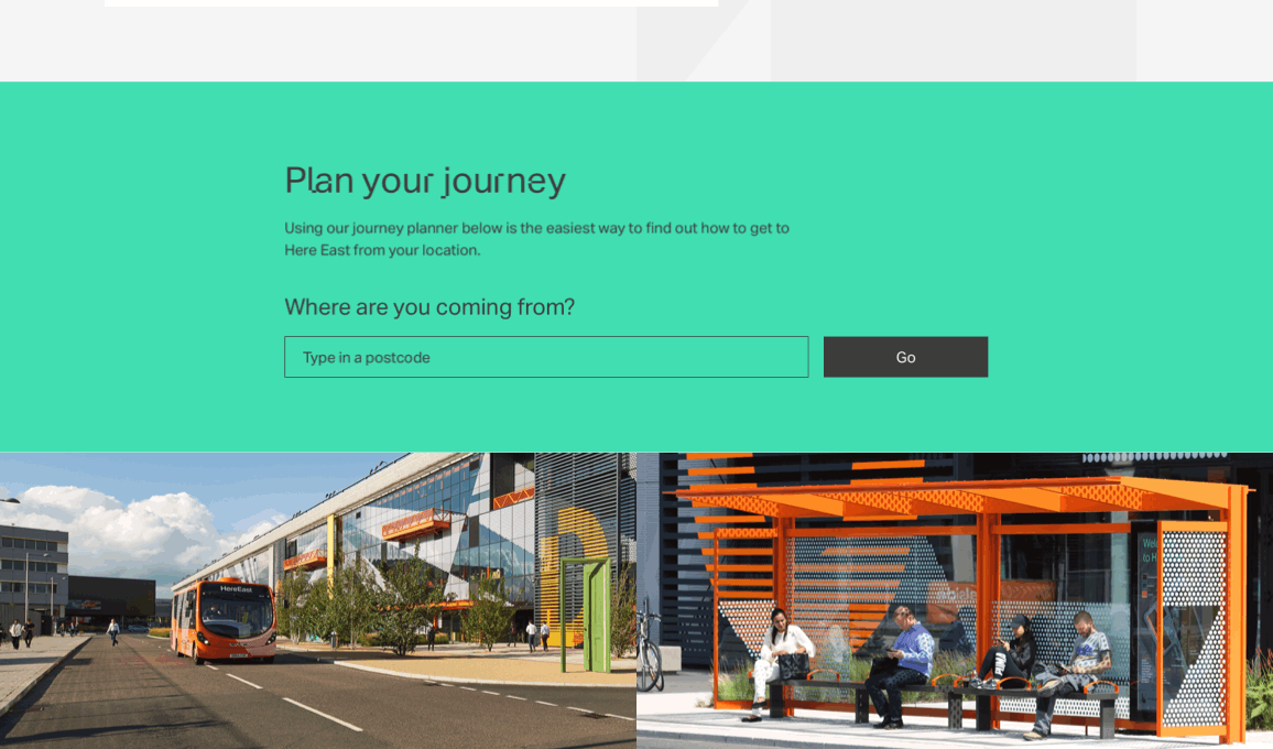
There are so many different ways to get to Here East, with some of them not even registered correctly on Google Maps / Citymapper. Visitors were often getting confused about which nearest station to go to, and then how to actually get to Here East once they were there.
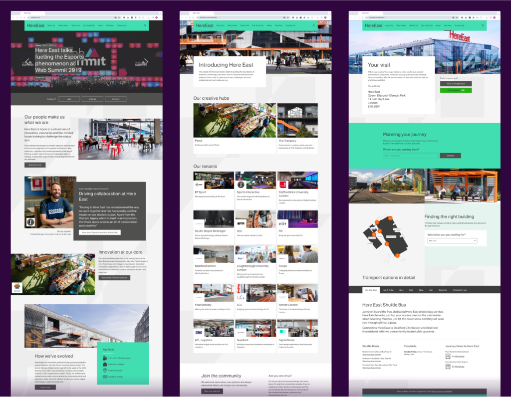
To solve for this, we created a custom journey planner, which takes the user’s postcode, relies on the TfL API to get them to the appropriate TfL station, and then serves custom directions (based on the TfL station) from the station to Here East.
Visitors could now get to the campus, but what about once they’re there?
There are lots of different entrances on the campus, and visitors were getting lost and finding it hard to know which entrance to use – especially when in time-poor situations visiting specific businesses / tenants!
We needed a way of showing the user which entrance to use, so we built an interactive campus map which shows where all the different tenants and businesses are on the campus, and highlights visually which entrance to take.
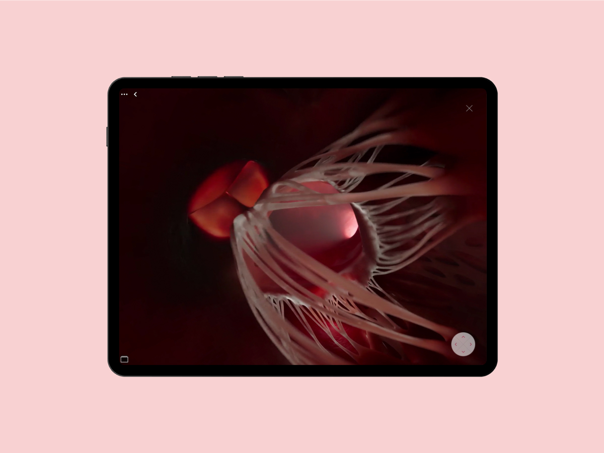
Adding micro-interactions to inject brand storytelling into designs
I was keen to keep the brand-specific ‘disruptive’ design elements as part of the new design direction and language – whilst still making sure the information displayed was really clear, and any functionality was easy to use.
Below are some of the micro-interaction details I designed to keep the brand spirit alive, like block colour hovers on events and the link rollovers.
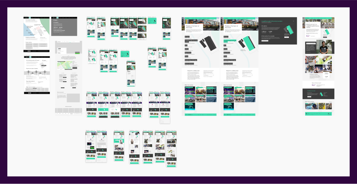
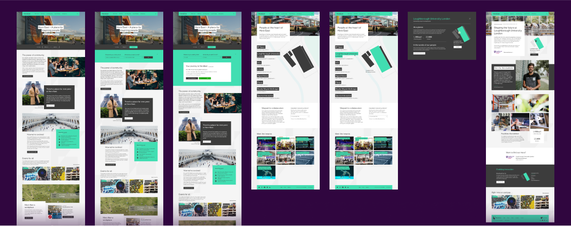
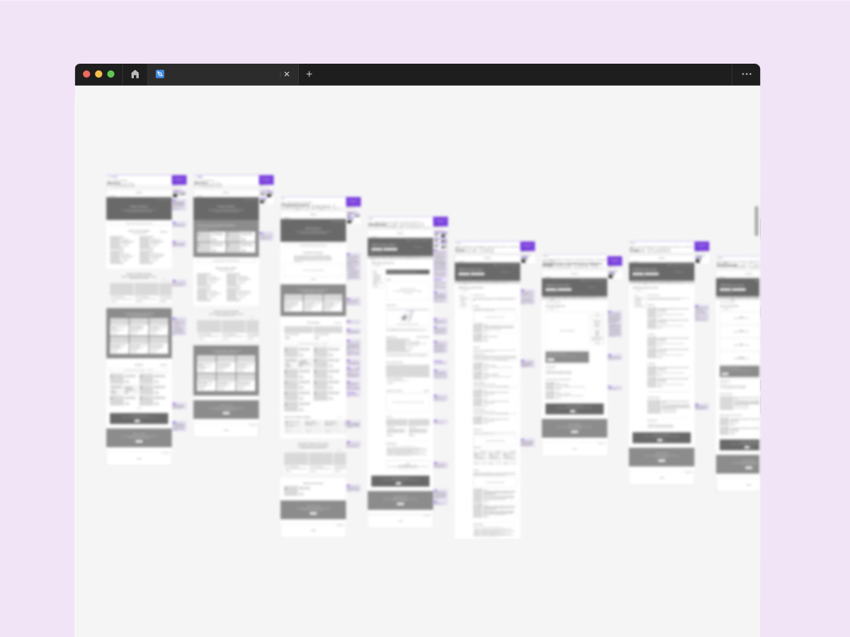
A refreshed & refined website to better meet visitor and tenant needs, while still keeping the brand ethos of disruption and innovation
Some screenshots below; the website is still live today at HereEast.com
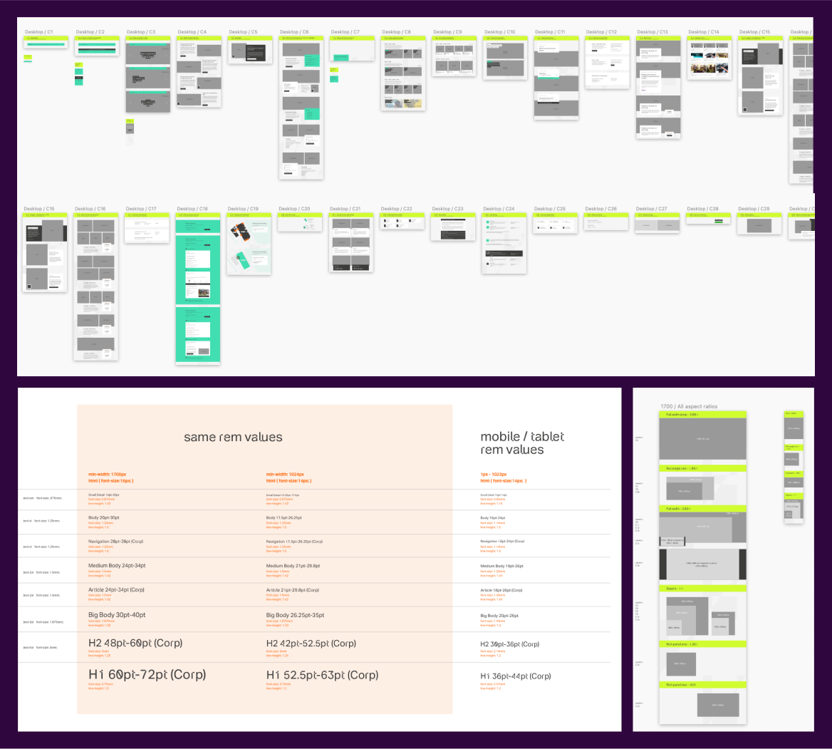
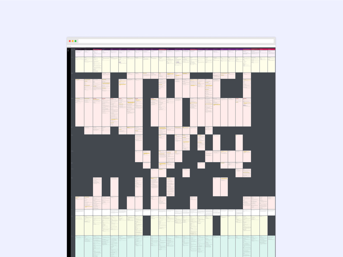
Powering the website with a custom-built design system
As we were designing, I built a design system from the ground up; covering typography (with responsive breakpoint code definitions for the development team) and components, as well as image sizes used in each component – which then were turned into a guide for the client for reference when updating the website.
When QAing development work, I also provided deployment-ready code fixes, to convey accurately the changes needed – and to make our busy development team’s lives easier!
Our very happy client sent us doughnuts on launch day!
Gareth from the development team, posing with the doughnuts.
Team
Tom Hostler – Head of Brand Experience Kayleigh Didcott – Senior Account Manager Annie Vue – Project Manager Aleks Melnikova – Head of UX Ron Siemerink – Head of Design Laura Hobson – Senior Experience Designer Jen Noon – Senior Experience Designer James Bradley – UX Designer Andy Dobson – Technical Lead Nuala Monaghan – Associate Technical Lead Gareth Cozens – Senior Fullstack Developer Malin Hanas – Creative Director Matthew Timms – Copywriter
Explore other case studies, initiatives & passion projects